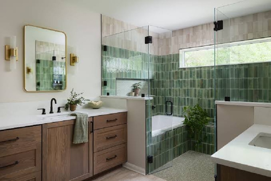
The ceiling is one of the surfaces that is least considered in any interior design. In most cases, wall paint colors are selected carefully. Care is taken in the choice of floor materials. But the ceiling is painted white, and then it is forgotten.
The truth is, the ceiling is a true design opportunity. It can transform the entire feel of a room. But only when used appropriately. So when do you go big or bold? When do you keep it subtle?
Read on to learn more!
When going bold makes sense
A bold ceiling is best used in a room that is deliberately kept simple in design. That is, if:
- The walls have no architectural decoration
- The floor is plain and uniform
- The furniture is minimalistic
- The theme is neutral
In such cases, the ceiling is just the right place to play with, without the room turning into a visual frenzy. You can use it to introduce:
- Pattern
- Texture
- Color
Dining rooms
A statement ceiling is particularly ideal for the dining area. In most cases, people spend time here while seated. Therefore, the eye naturally travels upward. When you go bold, the ceiling becomes part of the dining experience.
Read More: Tiling Choices That Help You Build for How You Actually Live and Optimize Design Outcomes
Entryways
Bold ceilings also suit spaces that are visited at a glance, like:
- Entryways
- Hallways
- Balconies
These spaces can afford a more adventurous ceiling treatment. The effect is immediate since the viewer just moves through the space.
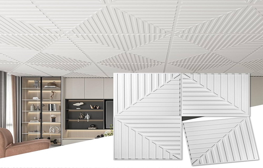
There are plenty of ceiling tile designs to consider, from the ornate pressed metal designs to the minimalist designs in geometric form. You can use them to add character to an architectural space without requiring a visible change in its structure or a deep budget.
When simplicity is the stronger choice
Rooms that are already taking some visual risks call for simplicity. That is:
- A bold wallpaper
- Patterned rugs
- Heavily layered furniture
- Busy walls
Such spaces almost always look better when the ceiling is simple. It provides a place for the eye to rest.
In a busy room, you may consider:
- A neutral white
- A very light-toned ceiling
In such cases, the ceiling serves as a visual expander. It prevents the room from feeling too cluttered.
Read More: Tiling Choices That Help You Build for How You Actually Live and Optimize Design Outcomes
Low-ceilinged rooms also tend to benefit from simplicity. Pattern and texture on a ceiling that already feels close to the head amplifies the sense of compression rather than alleviating it.
The bottom line
The clearest principle for ceiling decisions is this: the ceiling should feel intentional. A plain white ceiling in a simple room is a considered choice. The same white ceiling in a room that clearly needs something more is a missed opportunity.
Consider the existing character of the room, then respond deliberately. Also, always opt for texture over color in larger spaces. Here, a strong ceiling color can seem overwhelming. You may consider:
- A relief pattern
- A coffered grid
- A pressed tile surface
These elements create depth and dimension. But not the psychological weight that a dark or saturated color would add to a large volume of area.